Keypath Education Office Transformation
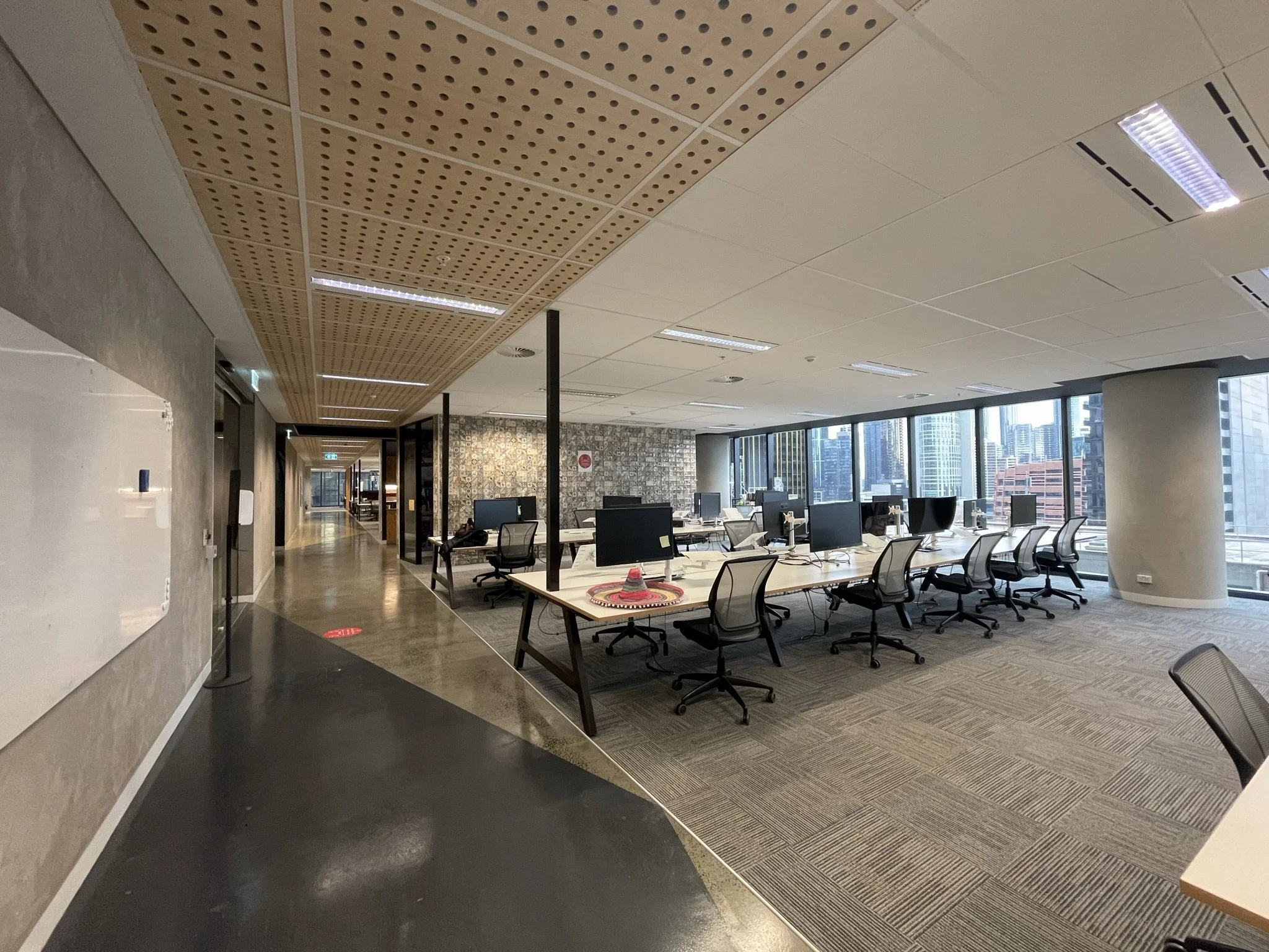
Keypath Education recently located to a new CBD office, providing them with the opportunity to transform a previously tenanted space into a bright, contemporary space for their workforce to return to after two years of Covid induced working from home.
As the organisation adapts to new ways of working, they are looking at shorter term leases that allow for a hybrid style of working. Central to this is the notion of the office as a collaboration space - a reduced number of fixed desks allowing for a rethink of zoning and space utilisation.
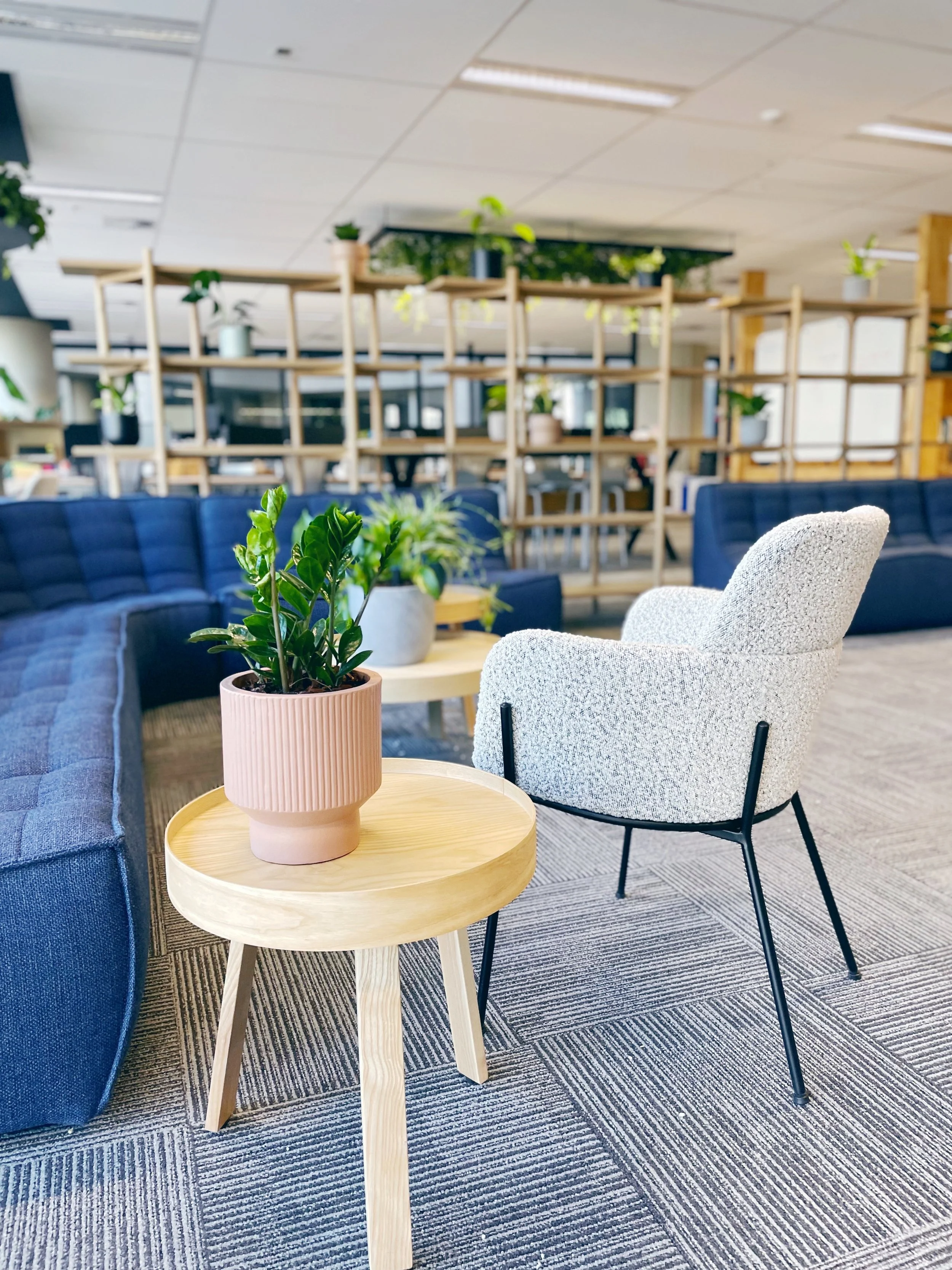
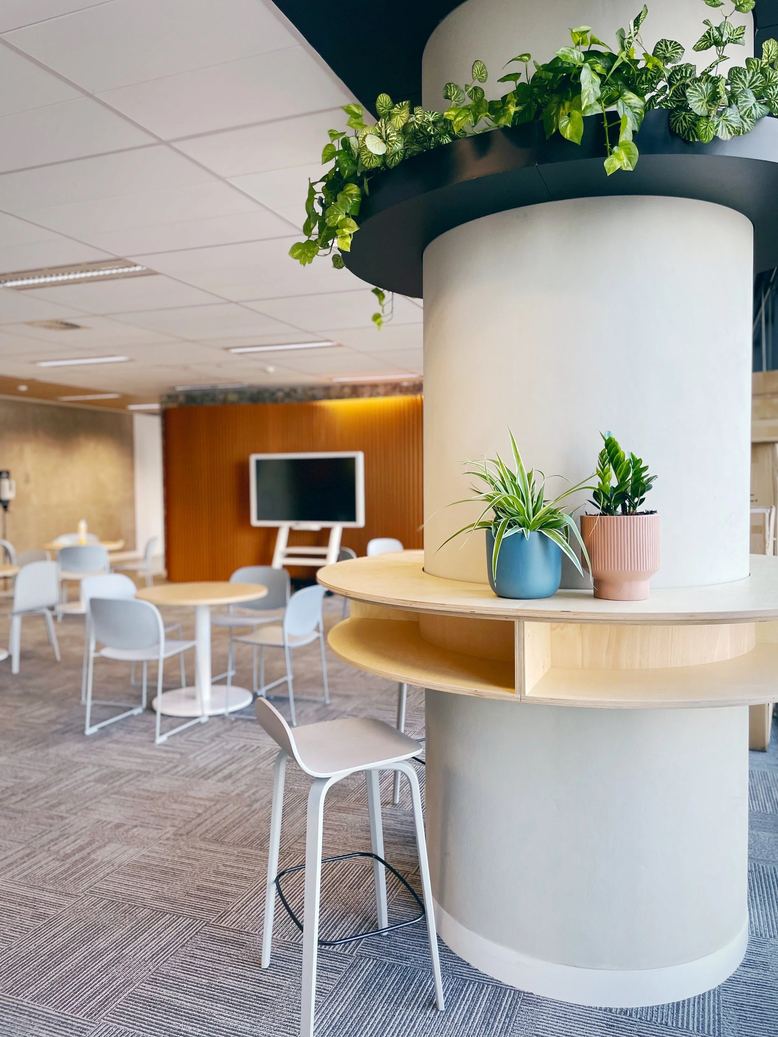
Top priorities included a large “Town Hall” zone which would act as a space to bring the team together, but also provide seating for casual catch ups, lunch and training / workshop requirements. A mixture of furniture here ensures the space is modifiable depending on who is using the space, with consideration given to view points of participants when projection screens are being used. Two large columns presented the opportunity to create “drop in” areas for staff wanting to break away from their desk or have an informal meeting with a team mate.
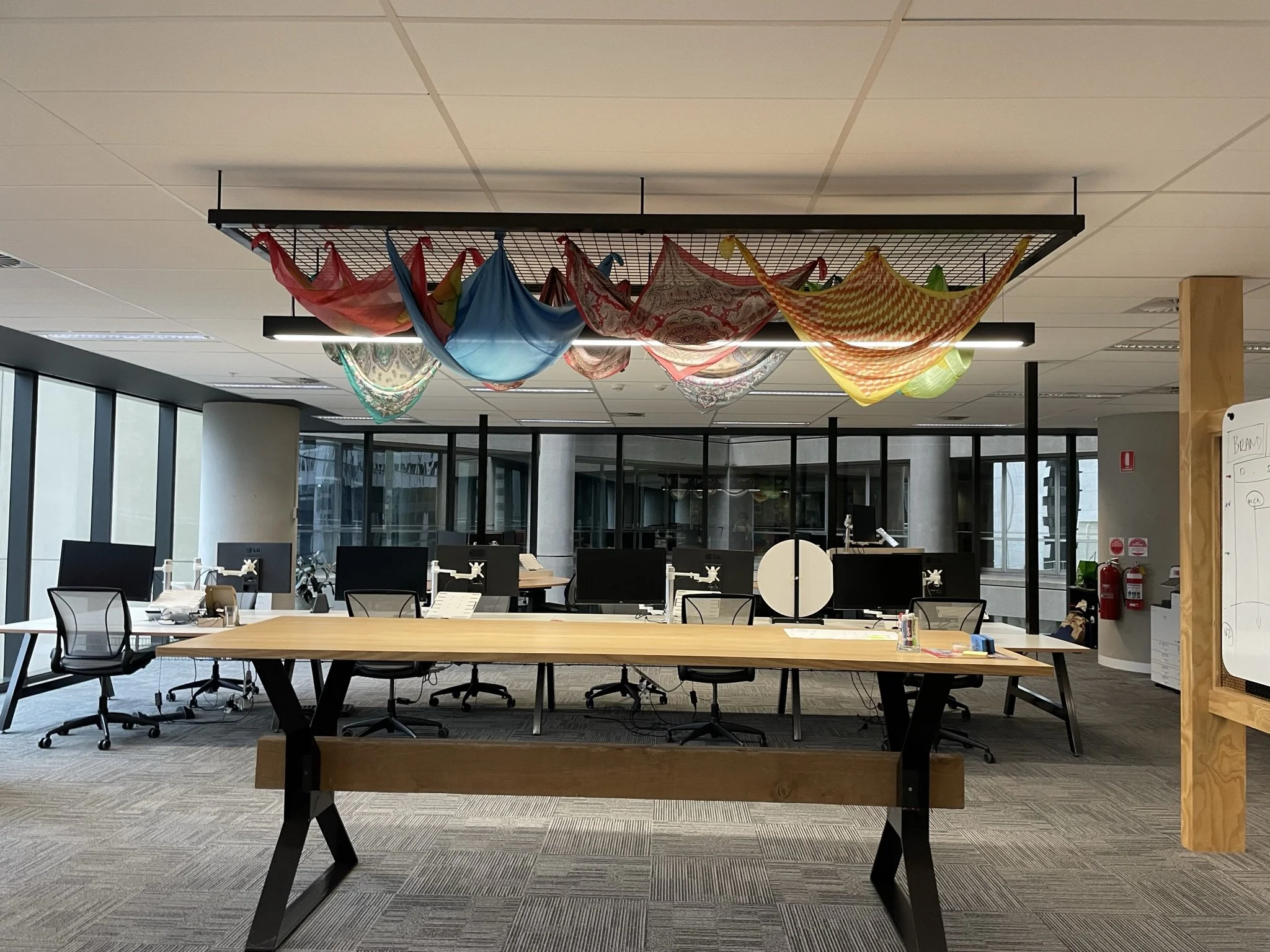
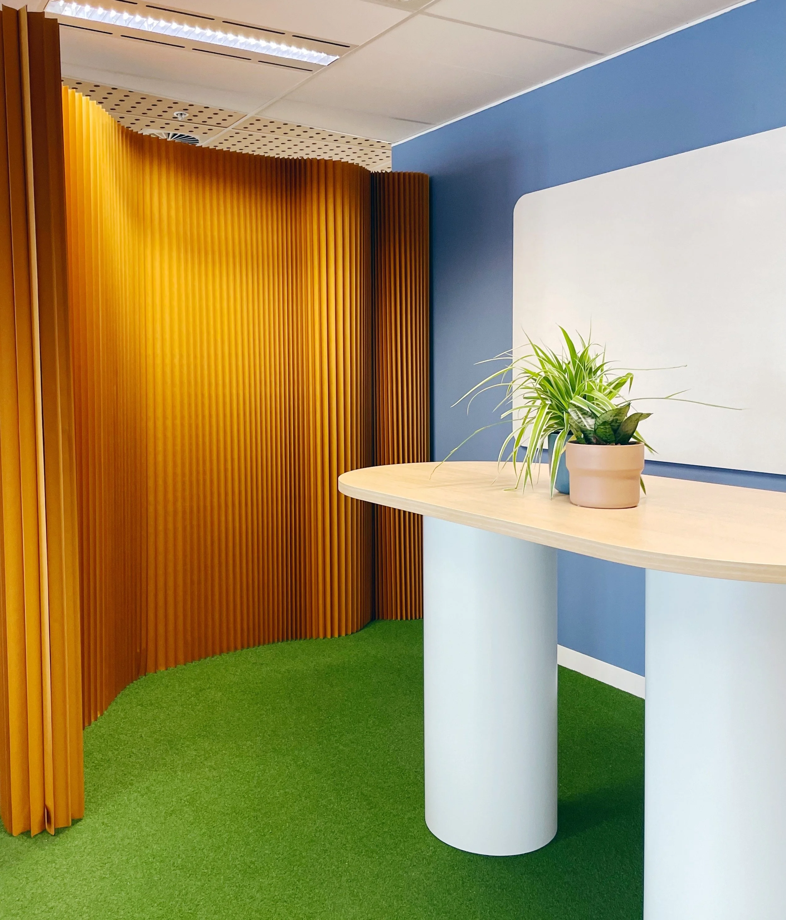
Three collaboration zones were established across the office, two large stand up tables with fixed whiteboards saw an enhancement of overhead greenery and a third space was created using collapsable cardboard walls for the ultimate in agility. These walls can be easily moved anywhere in the office to provide a backdrop or focus zone. This third collaboration space is perfect for larger group stand ups or focused project work.
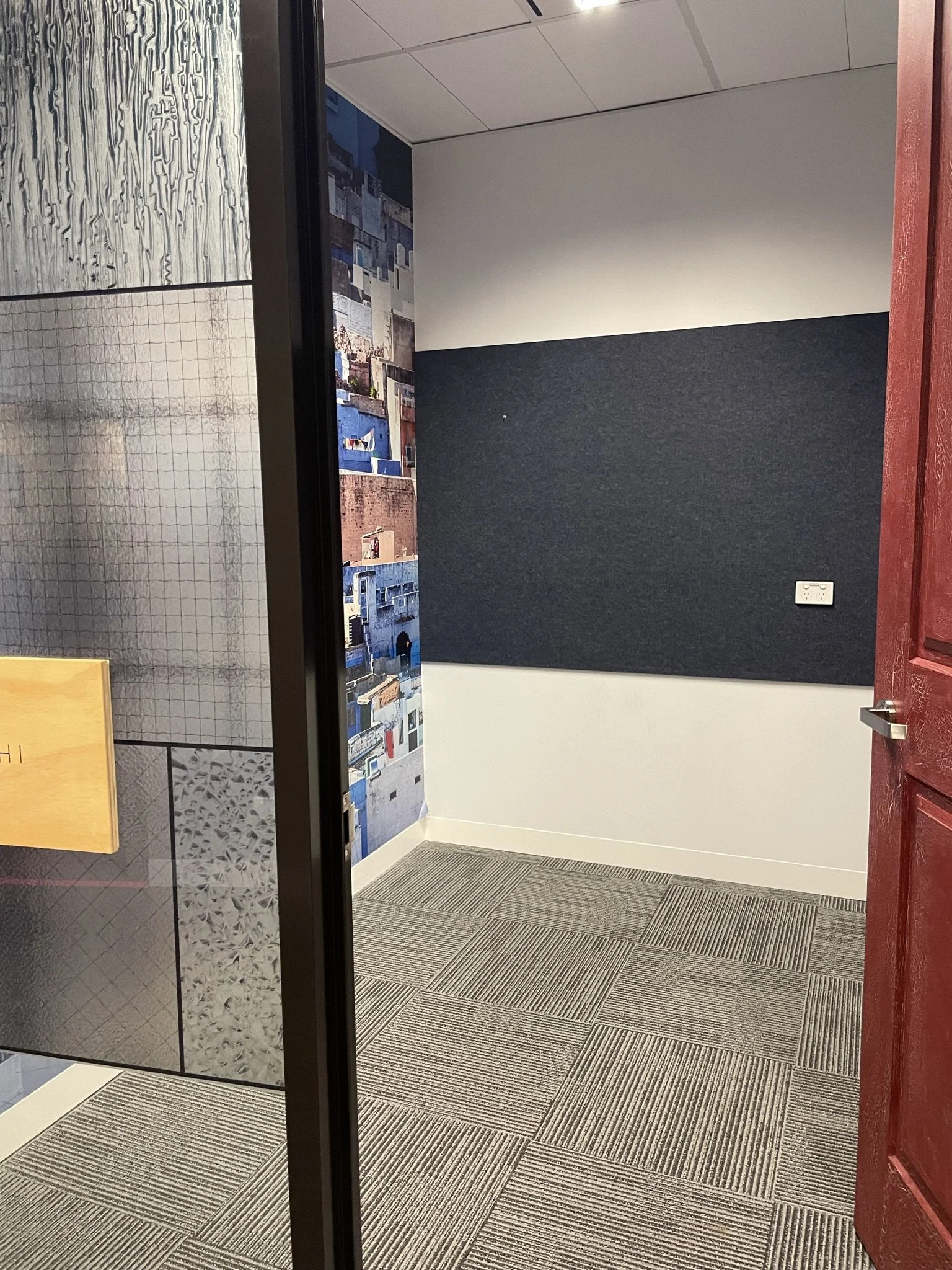
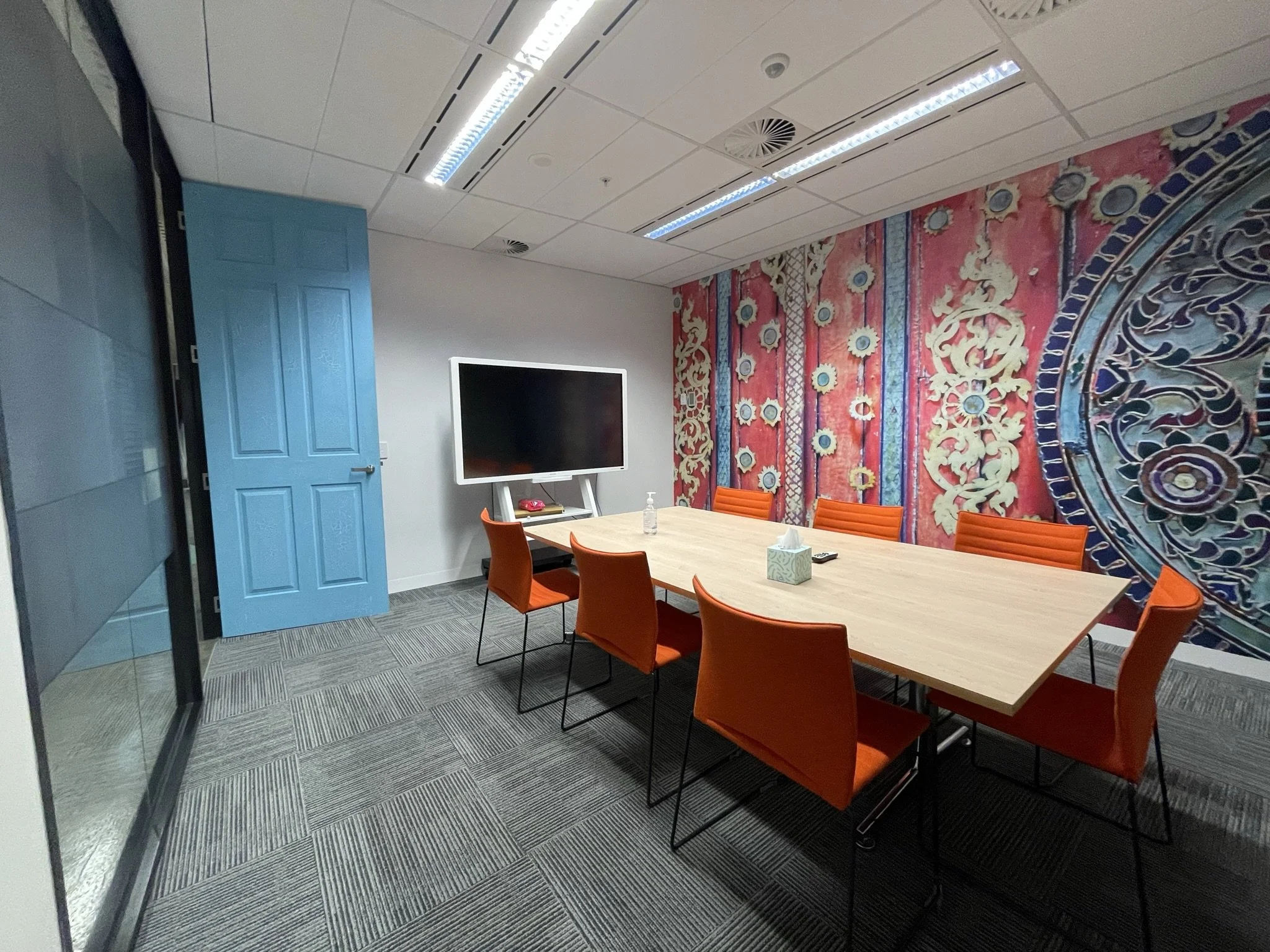
All meeting rooms were stripped of their dated decals and furniture, with new wall treaments and colour blocked furniture incorporated. The colours here are subtle gradients of Keypaths’ bolder brand colours, creating calming spaces for focused meetings.
The boardroom was one of two areas where the Keypath brand is front and centre with a full wall treatment incorporating the brand’s colours, messaging and brand marks. A welcome wall was also included in the Town Hall zone, not only does this incorporate branding in this location, but is the natural pathway for any guests being taken to the boardroom.
The design has been very well received, capturing the flexible approach required with a contemporary aesthetic.



The Before
Below is a series of images showing the office at handover. Whilst reasonably new, the finishes were dated and the layout created some awkward and minimally used areas.


